Update: In November 2022, WhatsApp finally launched polls, more than two years after I wrote this hypothetical case study. This was great validation for me, especially the fact that my designs weren't too different from the one WhatsApp designed to implement. I plan to conduct a deep analysis of the similarities and differences between my design and WhatsApp's own design, so stay tuned for that.
Why WhatsApp?
It’s used by more than 2 billion people in over 180 countries. Also, this is a need that I identified based on my experience on the platform. One should start with solving problems closer to home.
Side note: I do not work for WhatsApp, and the views from this case study are strictly my own. Unlike the designers who work at WhatsApp, I don’t have full access to all the user data that influenced their current design. As a result, this case study is not exhaustive, and I am certainly not suggesting that WhatsApp change their current design and adopt this one.
The problem statement:
How to arrive at a consensus faster in WhatsApp groups?
Groups are great. They help to increase engagement and gather large opinions fast. While the strength is in numbers, it can also be a cause for delayed decisions.
Let's take a simple example:
You find yourself home, alone and missing your friends. You decide to plan a catch up with all of them. Good news: You already have a WhatsApp group with all of them.
You put in the suggestion and the replies start pouring in and that’s when it becomes clear: To have the most people show up, the group will have to agree on a common time, a date and a place to meet.
The problem? Increased individuals increases the complexity.
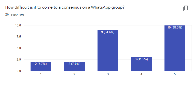
According to this research, Whatsapp groups usually have 20-50 members. That’s a lot of variables. I had my experience of countless failed plans but I wanted to know if this was a problem others face as well. As it turns out, it is:
Coming up with a solution:
So why is group based decision making difficult? Let’s start by breaking down the problem:
- Involves accommodating everyone's preference
- Involves accounting everyone’s preferences
The first is an ideological issue and will depend on how egalitarian you want your WhatsApp groups to be. (Spoiler: The majority generally gets its way)
The second however is a problem that can be solved with design. And it has been solved many times in different settings.
In complex debates for example, a system of colored cards is used to indicate speaker priority. Red cards to indicate a breach in rules of decorum, yellow cards for clarifying questions, and green cards for desire to speak.
But sometimes, a simple hand raise is the solution.
Simple. Easy. Elegant.
And this is what I would be replicating to an online experience.
Solution
A simple solution is letting users create a poll, and other users can vote on it. This has been implemented in other social media platforms like facebook, instagram, twitter, telegram, etc
I studied the design of each one of these and these were my observations:
- Facebook, Instagram and twitter had a very straight forward polling system. You set the question and the options and post it. As soon as someone answers it, they can see the proportions of how many people chose which option. Other than that they had a maximum of 1 extra feature.
- Telegram and some slack plugins gave more options like anonymity, option to choose multiple answers, make it a quiz, putting a timer on it, etc
Next I studied how whatsapp designs its features and what are their design ideologies so that my designs stay consistent. This article by Charlie Deets was very helpful to understand this. The 2 things I had to keep in mind were:
- Design a feature that is “obviously useful”
- Follow native design principles VERY strictly
Design decisions
Where should I place the option to create a whatsapp poll?
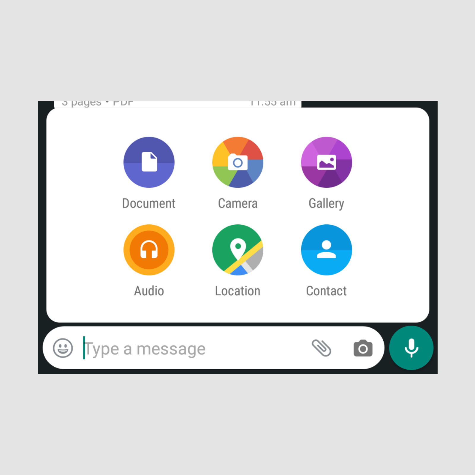
The best place to put the option to create a poll was with the other attachments. But as you can see that was already symmetrical and full
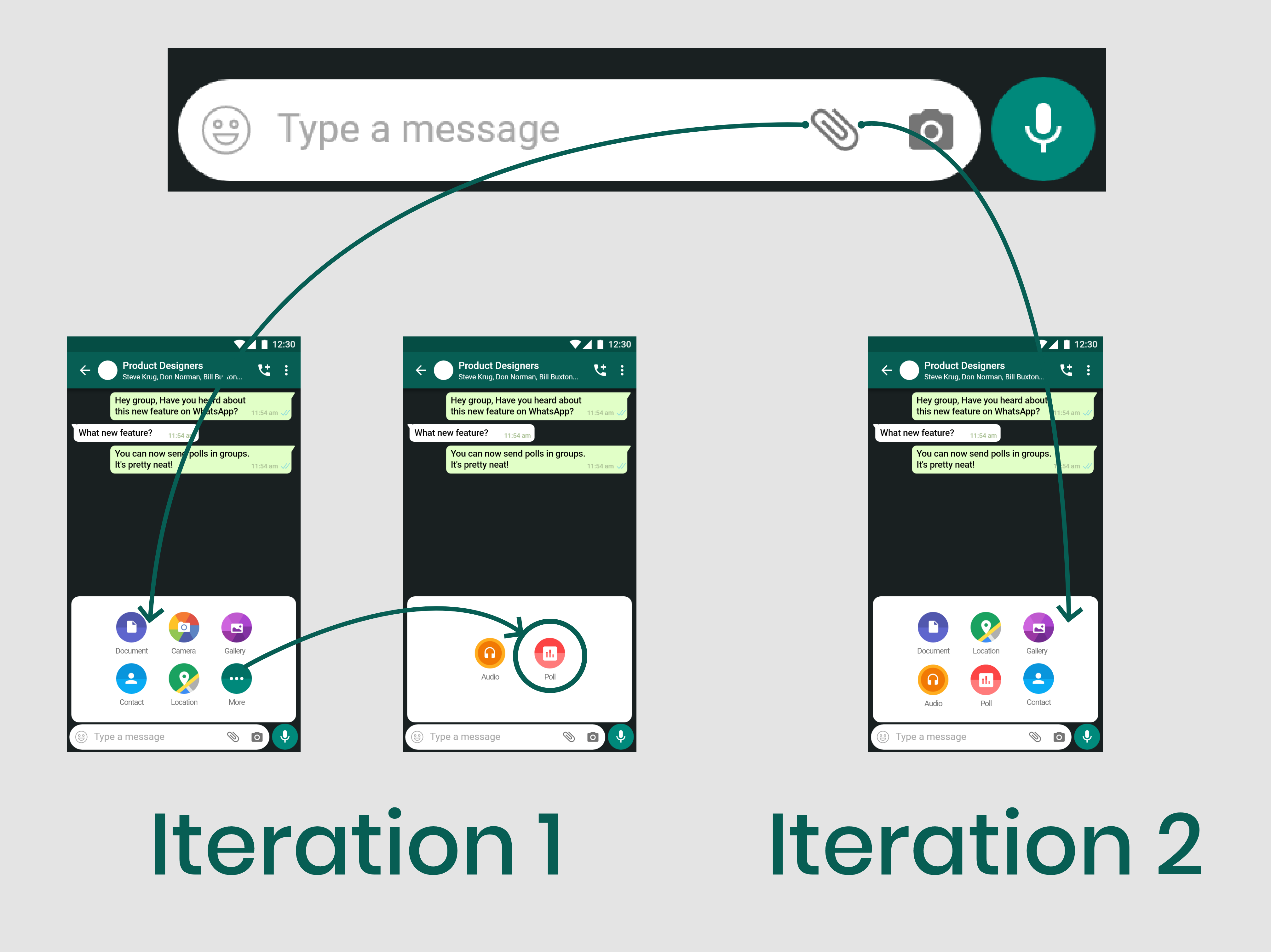
So I decided to add a new option “More” and put one of the attachments options with the new “poll” option behind it.
To understand which existing option I should put behind “More” I asked a group of 5 people to not look at their phones and name the attachments whatsapp has as options. The least recalled option was “Audio”. Nobody recalled that. So in my first iteration I put the “Audio” and the “Poll” option behind the “More” option
But then I realised that the camera option was redundantly placed in 2 places: 1) next to the attachment button itself; 2) inside the attachment folder as well. That's when I realised the symmetry was created by repeating the camera option twice. So I removed the camera option and placed the poll option in place of that.
The Poll icon is a stock material UI icon since I had to follow the material guidelines strictly on android.
What should the poll form include?
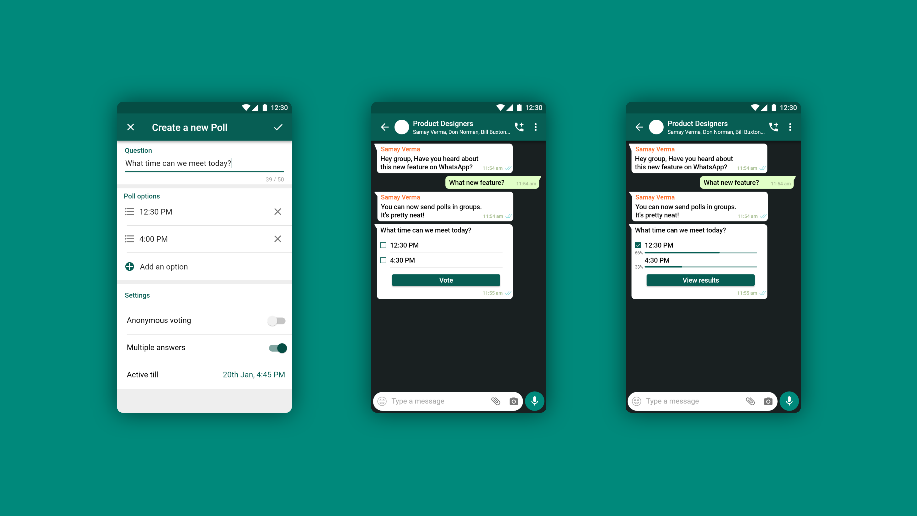
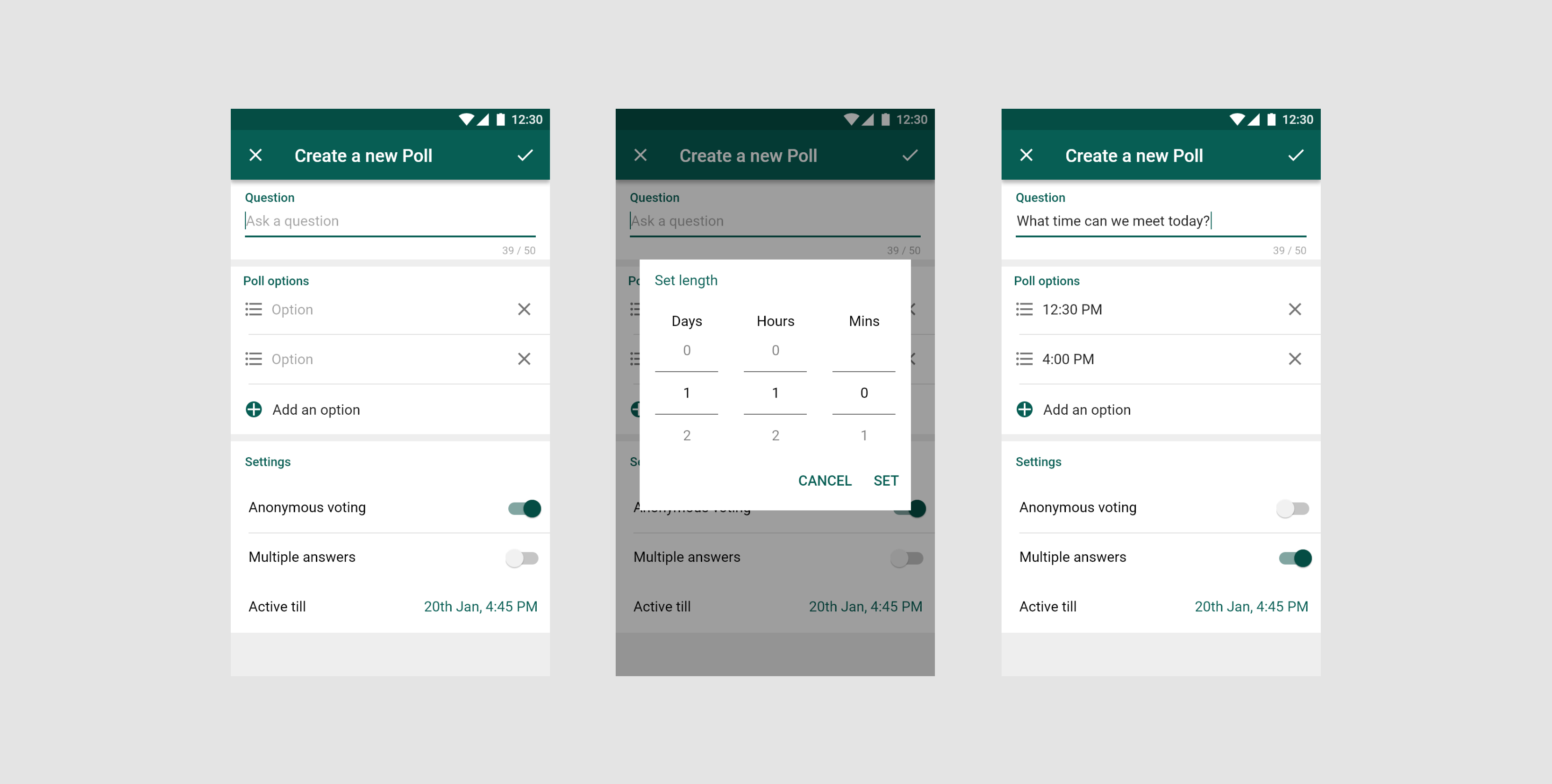
As discussed above, after understanding how other social platforms address the process of making a poll and considering the “obviously useful” principal of whatsapp design, I decided to include the following options in the poll form:
- A textbox to enter the question
- A textbox to enter a option, minimum options being 2
- An button to add more options
- An option to make the poll anonymous; where nobody, not even the creator, will be able to see who voted for which option. Users would only know how many people voted in the poll.
- An option to add multiple answers; so that users can choose more than one option in the poll created
- And a time limit to finish the poll
How should multiple answers be different than a single answer poll?
The main differentiating factor between the 2 kinds of polls, Multiple answer poll and single answer poll, was the universally understood difference between a checkbox and a radio button. The other difference was that the multiple answer poll had a CTA button to cast the vote after all options were selected. On the other hand, single answer questions were posted as soon as the option was selected.
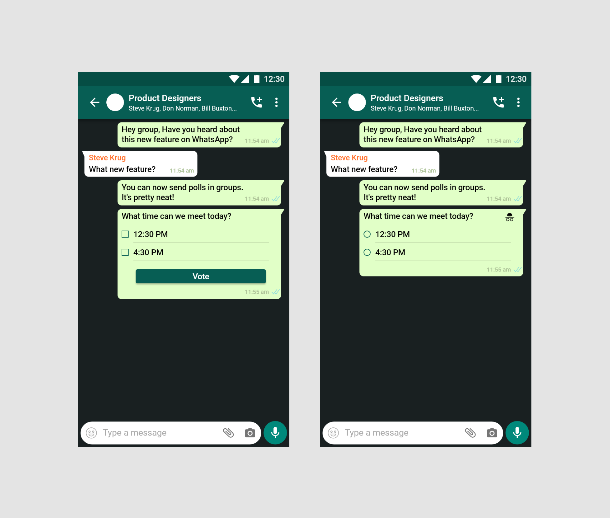
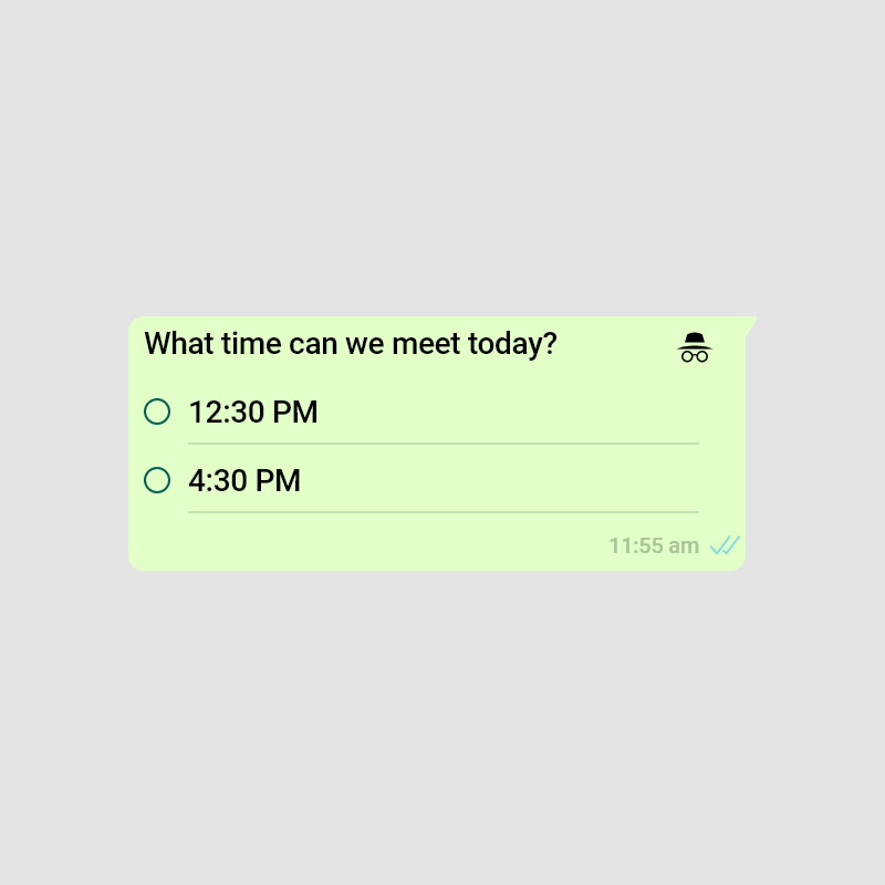
How to visually tell users when a poll is anonymous?
I used the same icon as chrome’s incognito as that is a well known signifier and also comes with the material UI kit.
How to increase engagement and reception?
To understand which other had the most reception among other social media polls, I asked my respondents to recall which of the social media apps they used had a poll feature in them.
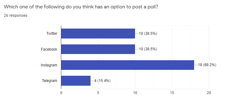
Instagram stands out. After brainstorming with a few other designers we came to the conclusion that polls on instagram are more popular because they are hard to miss. While on other social media, the poll can be buried under other conversation, never to be seen again, on instagram the story will keep popping up until you've seen it or it expires.
This makes sure that the poll gets maximum votes and also helps making people more familiar with the feature.
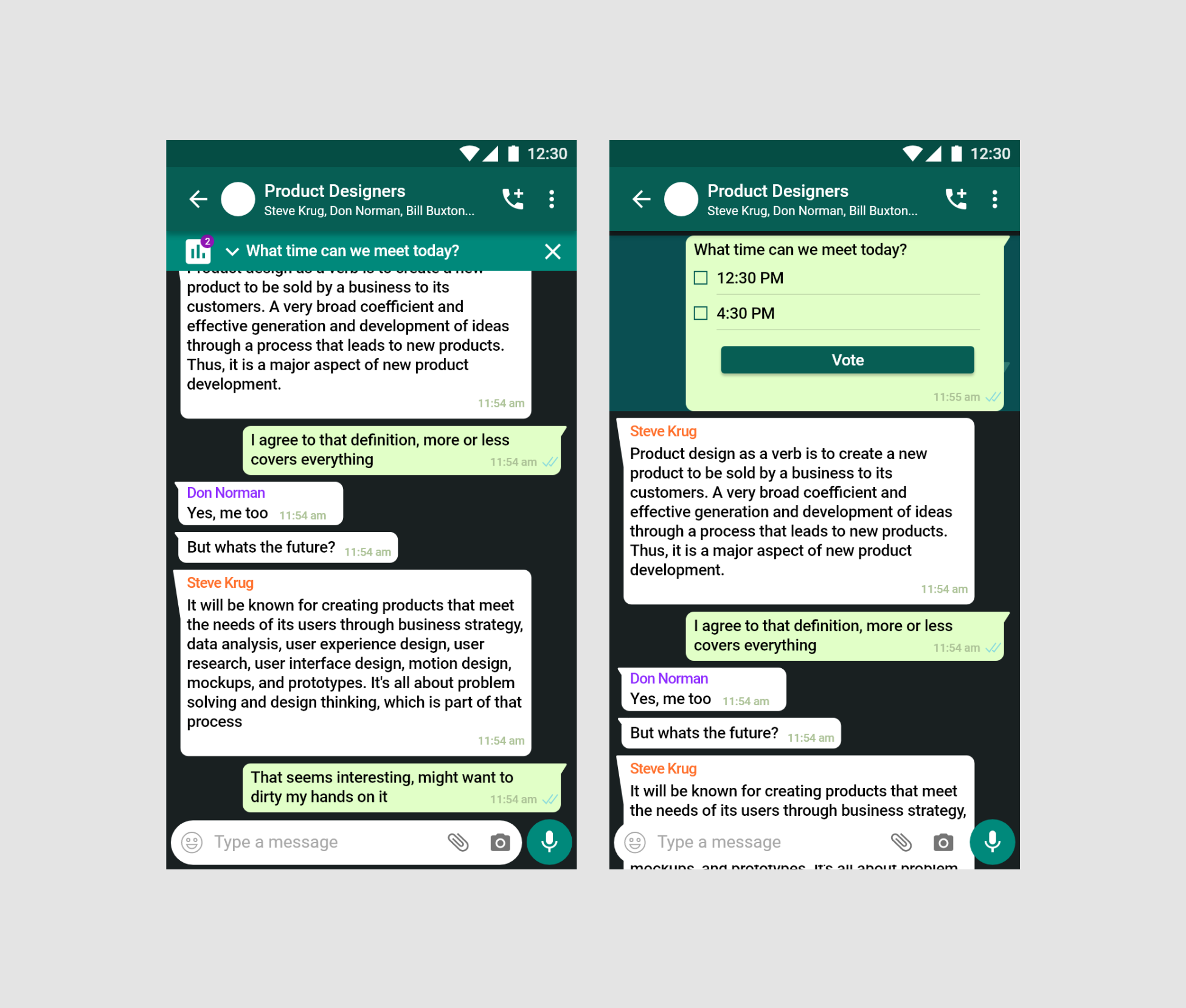
To implement something similar on whatsapp, I added a small pinned section on top of the messages that tells the user that there is an active poll that they haven’t voted on. Clicking on it scrolls up to the poll.
Final designs

Improvements
I definitely have a lot to improve here. Some of the improvements that I am looking to integrate in the future are:
- Make an iOS and desktop version for the same feature
- Make a dark mode for the feature as WhatsApp recently ruled it out for android as well
- Do a more exhaustive user research with demographics spanning more than just one country