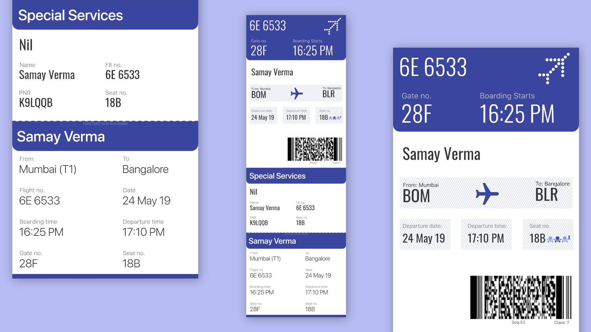
Do you have travel anxiety? I do. It only hits me when I’m at an airport. I keep checking my boarding pass to confirm if I am in the right place, if I’m on time, If this is the correct terminal. For the longest time I blamed myself. But, then I read “The design of everyday things” and shifted the blame to the bad design of boarding passes. And now I've decided to fix it.
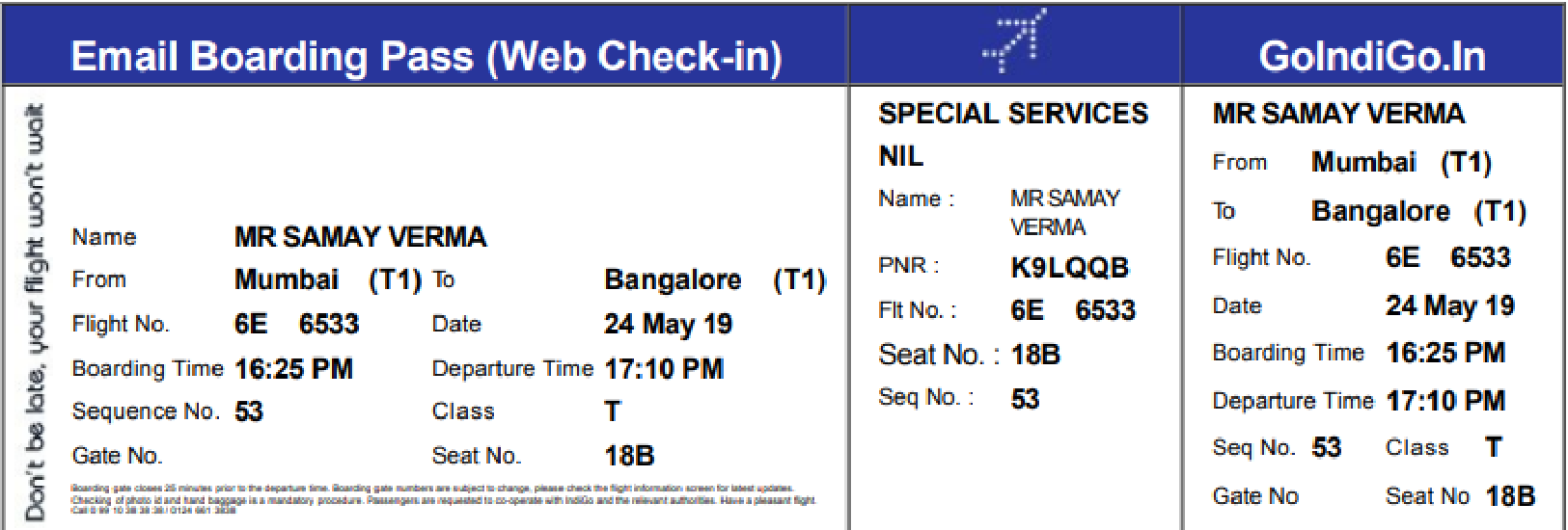
To begin with I looked at the existing boarding pass I had. I had seen it before, but now I was really looking. I analysed it and came up with these set of problems:
-
No hierarchy
All the information on the pass has the same emphasis here. My seat number is given the same importance that the sequence number is. What is a sequence number??
-
Size
The boarding pass doesn’t belong anywhere. It doesn’t fit in your passport, just hangs out of both ends clumsily. It doesn’t fit in your pocket (if it does you have extraordinarily large pockets). It belongs awkwardly in your hand or between your lips when your hands are busy. yuck!
-
Signifiers and copy
The boarding pass uses no affordances. The only recognisable element in the whole pass is the text which is more difficult to process than an image or an icon. This increases the cognitive load during an already stressful time.
Now that I know there are definite issues with a boarding pass’ design, I wanted to see if anyone had attempted to solve it before. Didn’t want to reinvent the wheel. To my surprise there were quite a few! But I quickly learnt that boarding pass was one of the #DailyUI challenges and most of the references I was seeing were just merely making the boarding pass look pretty (most made the UX worse)
But there were a few who improved the UX as well. You can find the ones I took inspiration from at the end of this case study. All of them make significant improvement, but I thought there was still room for improvement. So I set out to fix them myself.
Constraints
Before starting my project I wanted to set constraints for myself. It helps me produce a more feasible outcome, challenges me more and makes this side project feel more like the real world
-
Include all information
I wasn’t going to discard any information from the present boarding pass. Just because you and I don’t find it useful doesn’t mean it isn’t. You see there are 2 users for a boarding pass; the passenger and the staff. Since while on my research I found that all information on the boarding pass had a reason to be there and had to be included. I still set an hierarchy to them, but more on that later.
-
Use same colors
A single check in counter would print more than a 1000 boarding passes per day. Adding a color to the design could add significantly to the cost. So I am going to use the same 3 colors as the present boarding pass uses; Blue, Black and White
-
Maintain the format of data
I am not going to look into the best unit to use for date/time or how a particular city should be spelt. That is out of the scope of this study.
Now that I have everything I need to know about my project, I can dig into it.
Information architecture
After a lot of research for this project what I understand of information architecture is this: It is the process of arranging information in the best possible way so as to increase usability and convenience. It's my original, so quote me on that.
This was going to be the most important part of the project since there is only one “Screen” and the main job is to arrange its information in a better way.
There are 3 distinct sections on the boarding pass
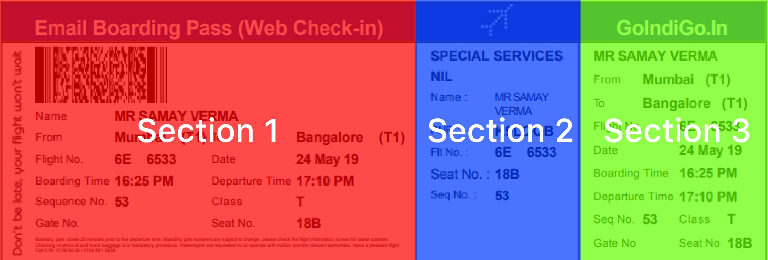
- Section 1 has 11 elements
- Section 2 has 6 elements
- Section 3 has 9 elements
My work will mostly be to improve the Section 1 because section 2 and section 3 are used by the staff and I had little knowledge about it*.
So I started by dividing the first section into 2 main parts and then subparts:
- My first division is on the basis of who uses the information:
-
- Staff
- Passengers
- I further divide the 2nd category, passengers, on the basis of when they use this information:
-
- Pre-boarding
- Post-boarding
So at the end the information architecture looked like this:
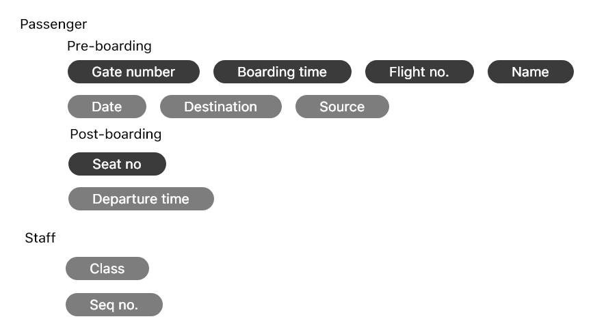
Passenger:
-
Pre-boarding
Pre-boarding is the time between you collecting your boarding pass from the kiosk or the counter and getting it scanned at the boarding gate to get entry to the aircraft.
During this time the user does the following activities:
- The main activity is moving from the check in area to the boarding gate. We therefore give gate number a top priority
- He might have to perform a tertiary activity like eating food or shopping before reaching the gate. During that time he needs to know the exact time the boarding will start. He also needs to know the flight no. to keep checking the live update of the flights arrival.
- There might be more than 1 passengers travelling together, therefore the name of the passenger becomes important so that the passes aren’t mixed up.
- The date source and destination is something an anxious man like me might need till the time he isn’t on the flight, other than that its mostly used by the airport staff. That is why its low on priority
-
Post-boarding
This is the time after boarding the flight. In this period the user might do the following activity:
- The main activity is to reach their designated seat. The seat number is therefore vital.
- The other thing one might do is check the exact time the flight is supposed to take off. Therefore departure time is included here though in low priority.
Staff
In the section 1 there are only 2 items that the staff needs exclusively:
-
The sequence number.
After a little research I discovered that the sequence number is how many passengers you have checked in. It is seldom used for purposes like allotting upgrades if available, checking missing baggage, etc. so not very important for the staff as well I assumed.
-
Class of the seat
Design

layout
Layout was supposed to tackle the problem of carrying the boarding pass around. So I thought about all the things I already have on me in an airport that can carry an important piece of paper. Most references I had placed it in the passport. I rejected that idea for 2 reasons:
- I thought that it was a little risky because the pass could easily slip out of the passport
- I was redesigning the boarding pass for indigo and most of their travel is domestic, so not a lot of their passengers carry a passport.
The other logical location was the wallet/purse. It had everything I needed:
- Everyone has some kind of wallet/purse with them at an airport(mostly)
- It already has important pieces of papers (Money, of course)
- You are already trained to not lose it
So, I decided to make my new and improved boarding pass the same width as the ₹100 note. I added a fold at the same height as of the note so that the pass fits perfectly in the wallet.
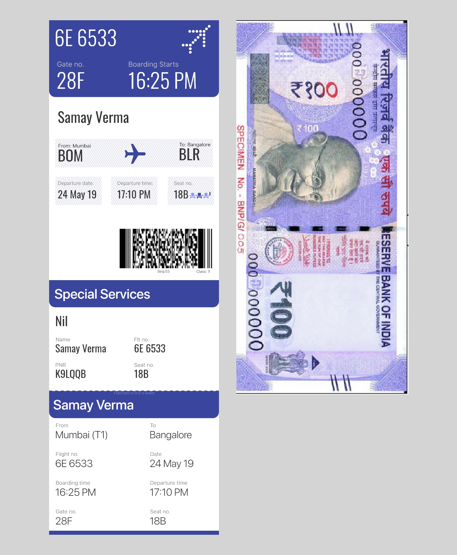
The other major layout change I made was that I turned the boarding pass from landscape to portrait. I did this for 2 reasons:
- Because it reduces the horizontal length that your eyes have to scan. This has been proved to enhance readability
- The ₹100 note has the same dimensions as my phone. So we are already very familiar with holding that form factor in portrait mode
Structure
-
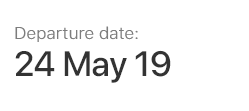
Made the heading bigger
I understand that the header was kept big so that people with weaker eyesight can also read with relative ease. But I found that by decreasing the size of the headings I had more space to fit the actual information. This would mean that I could increase the size of the information and the viewers will be able to read that with more ease. This also helps with hierarchy. Once I know what information is where it becomes easy for me to verify it again.
-
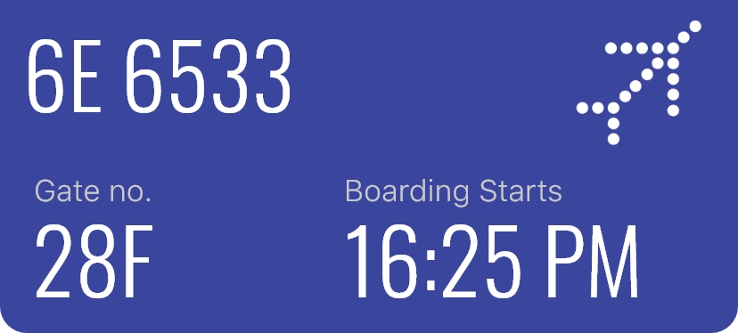
Used available colors to add maximum contrast
The colors available to me were scarce. I didn’t want to use fancy overlays or backdrops because they would add to the visual clutter already available in abundance. So I used all combinations of contrast to set a hierarchy and made sure I squeeze the contrast potential out.
-
Introduced icons
As discussed above the present design definitely needed some signifiers. I knew I had to use them scarcely as well because every new signifier would add to the learning curve.
I decided to use them to signify departure and arrivals so that it's easier to navigate that information.
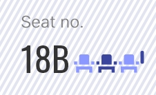
The second place I used them was to signify which seat, aisle middle or window, was allocated to the customer. This is for every time one had to explain someone that they’re in my seat even though the seat “number” is same
-
Changed copy
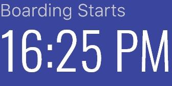
I just made a small change in the copy. I made “Boarding time” into “Boarding starts”. This is because the prior didn't make clear whether the boarding time is for when the boarding ends or when it starts.
