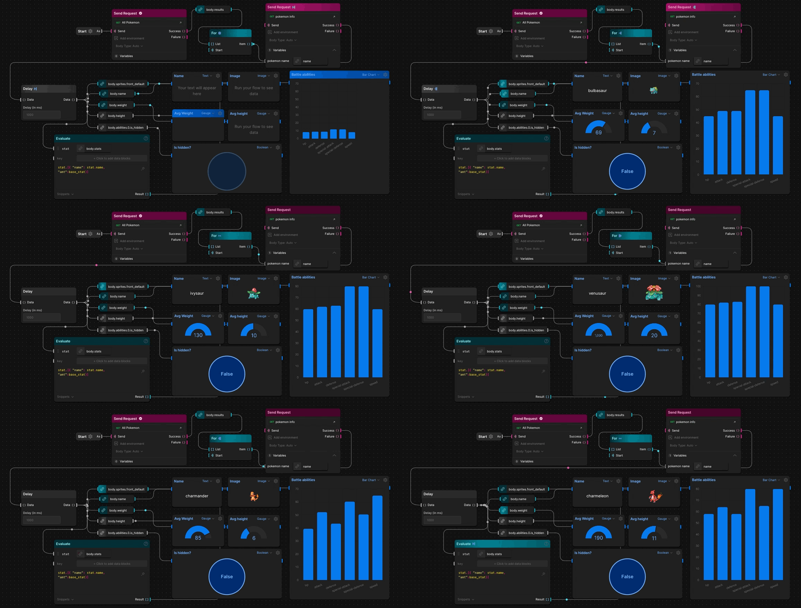
Postman Flows is a visual tool for creating API workflows. It's perfect for users who prefer not to dive deep into code or who lack the technical know-how. With Flows, you can easily connect API requests, handle data, and create real-world workflows using visual interfaces.
What is an API, you ask?Just as we use a Graphical User Interface (GUI) to talk to software applications, software applications use Application Programming Interface (API) to talk to other Apps. Flows helps you visually define how these Apps should talk to each other to build a new app.
Here's an example of how different apps can be combined to create a complete e-commerce solution. You can use Google's Authentication app to secure user accounts and connect it with Shopify's carting app to create a seamless shopping experience. You can also add Stripe's payment processing app to handle transactions securely. By integrating these different apps, you can create an bare-bones e-commerce app without writing any “code”.
Origin story
Around the end of 2020, some smart folks in the runtime team started tinkering with the idea of a new programming language meant to act as a glue between two APIs. This would help create business logic for API-first applications faster.
Started of with a team of two, today we are 8 member strong
Soon we created a new team, Labs, that worked exclusively on 0 to 1 projects (or Loonshots) inside of Postman. Flows became the first project in Labs. We started with a team of 2, an engineer and a designer (yours truly). In the initial few months, we knew we wanted to create a visual language that looked like flow diagrams and had data flowing through it. Today the team is 8 members strong, 2 designers & 6 engineers.
How we designed Flows
1. Initial research
When we started out, we knew we wanted to create a visual system to connect two APIs. So, we spoke with users who were already building API workflows in code to draw a diagram or a flow chart to explain how their systems work.
This gave us great insight into how people intuitively depict logic visually. During these sessions, we observed their micro-decisions on how to show data, construct loops, and evaluate data. We used this information to inform our decisions when starting to design the building blocks of Flows.
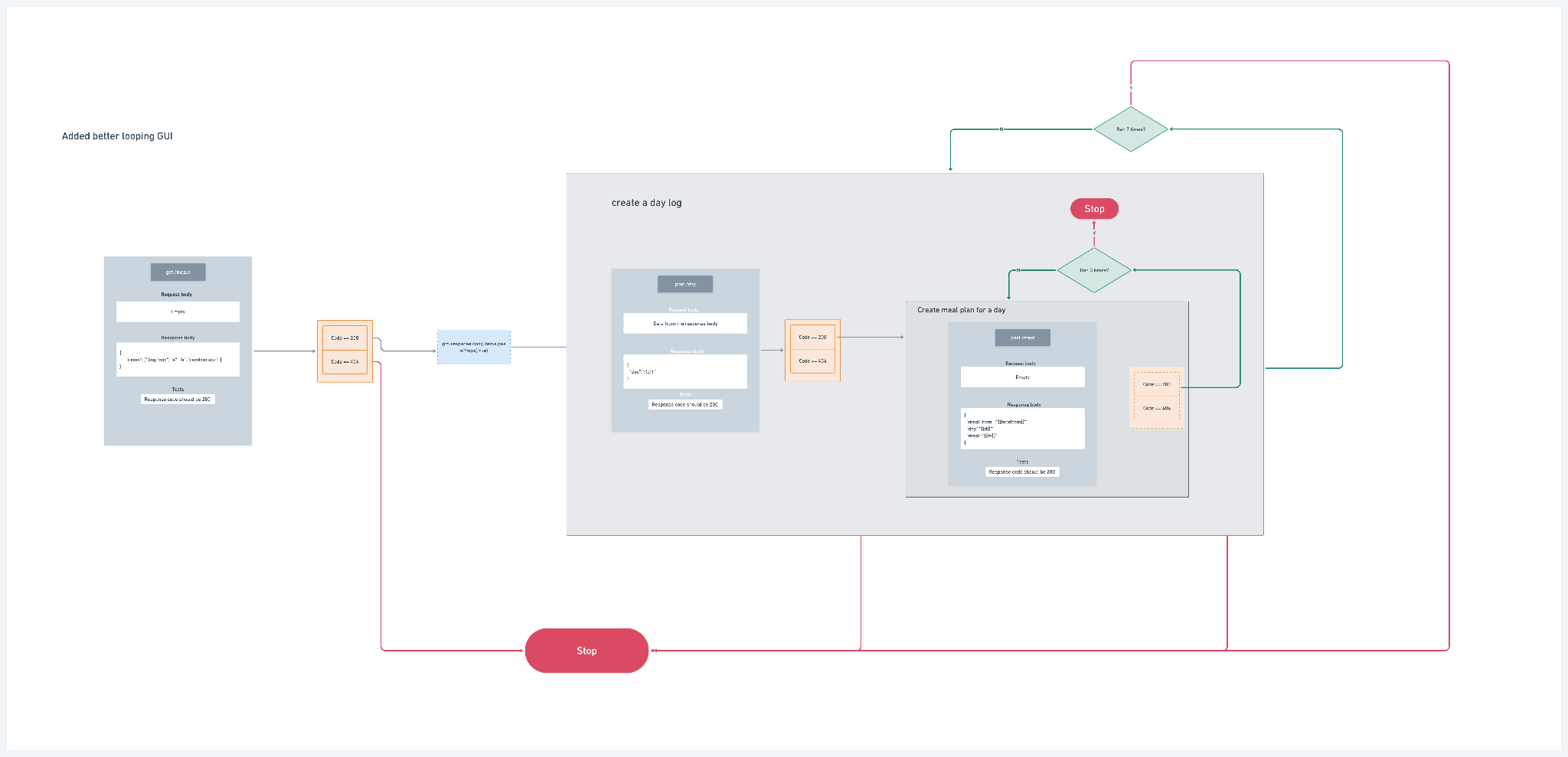
We also created and maintained a live list of use cases from our interviews. This informed our decisions throughout and helped us align ourselves to the right direction in the long term.
2. Foundational Principles
Before even creating wireframes we sat down as a team and decided on a few principles that could guide our design language and micro decisions that are aligned to the vision. We decided that we want to create an interface that is:
-
Learnable - Not everything can be oversimplified and that’s okay. We should optimise for discoverability and understandability.
-
Composable - Flows should introduce components that can be combined together in endless combinations to get simple as well as complex outcomes.
-
Invisible - The main task of flows is to get out of the user's way. We understand that the users are here to craft their master plans, so every new thing we add is a potential pebble on the highway.
These principles have remained with us since the first day and guided our discussions around smaller features as well as longer term plans.
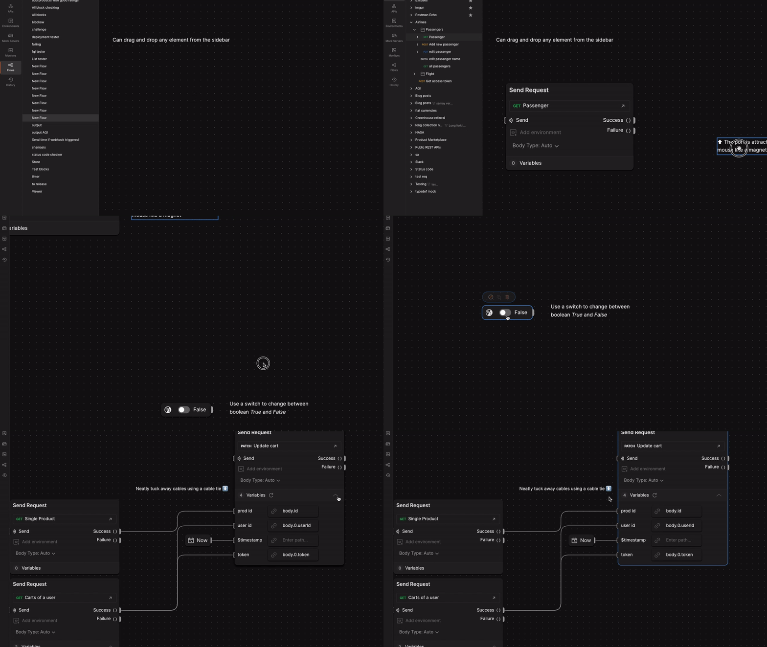
3.Personifying physical objects in the interface
Since flow is a visual way to program we wanted stay close to our interactions with the real world. This meant really diving deep into the physics and personifying interface components as physical objects to decide their behaviour.
4. Designing for development
One year into building flows, I noticed some inefficiencies in my design process. Frequent redesigns were necessary due to missed edge cases, and developers had to come back to me with questions on how to implement certain designs.
To address these issues, I sat down with the team to analyze the incidents and develop a system for designing that benefits everyone. We agreed that we need a system that allows for faster feedback loops in the early stages of designing and reduces the number of iterations needed.
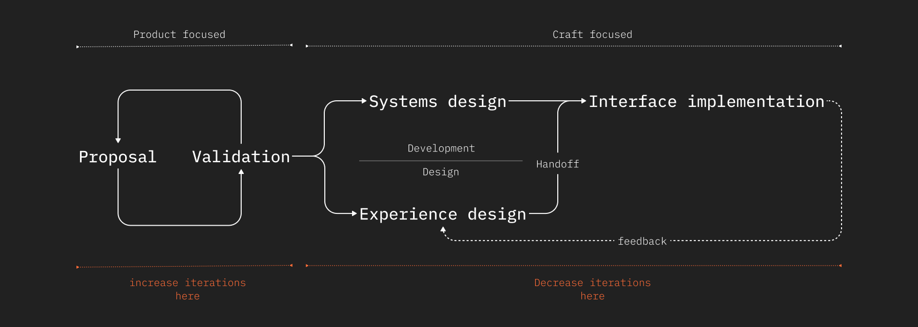
We looked at the current design process and saw that even though I was creating components, my deliverables were mostly “Screens”. But when developing these designs we were using component based frameworks like React. So we came up with a system of designing that focused on every component instead of entire screens.
All designs would now be component specs. And each component would have 3 elements:
- States - These are the various forms in which a single component can exist in
- Behaviours - What interaction or force changes the component’s state from one to another
- Changes - a sort of archive that lists the various changes in the component over time. This helps archive decisions and also point out exactly what is to be worked on
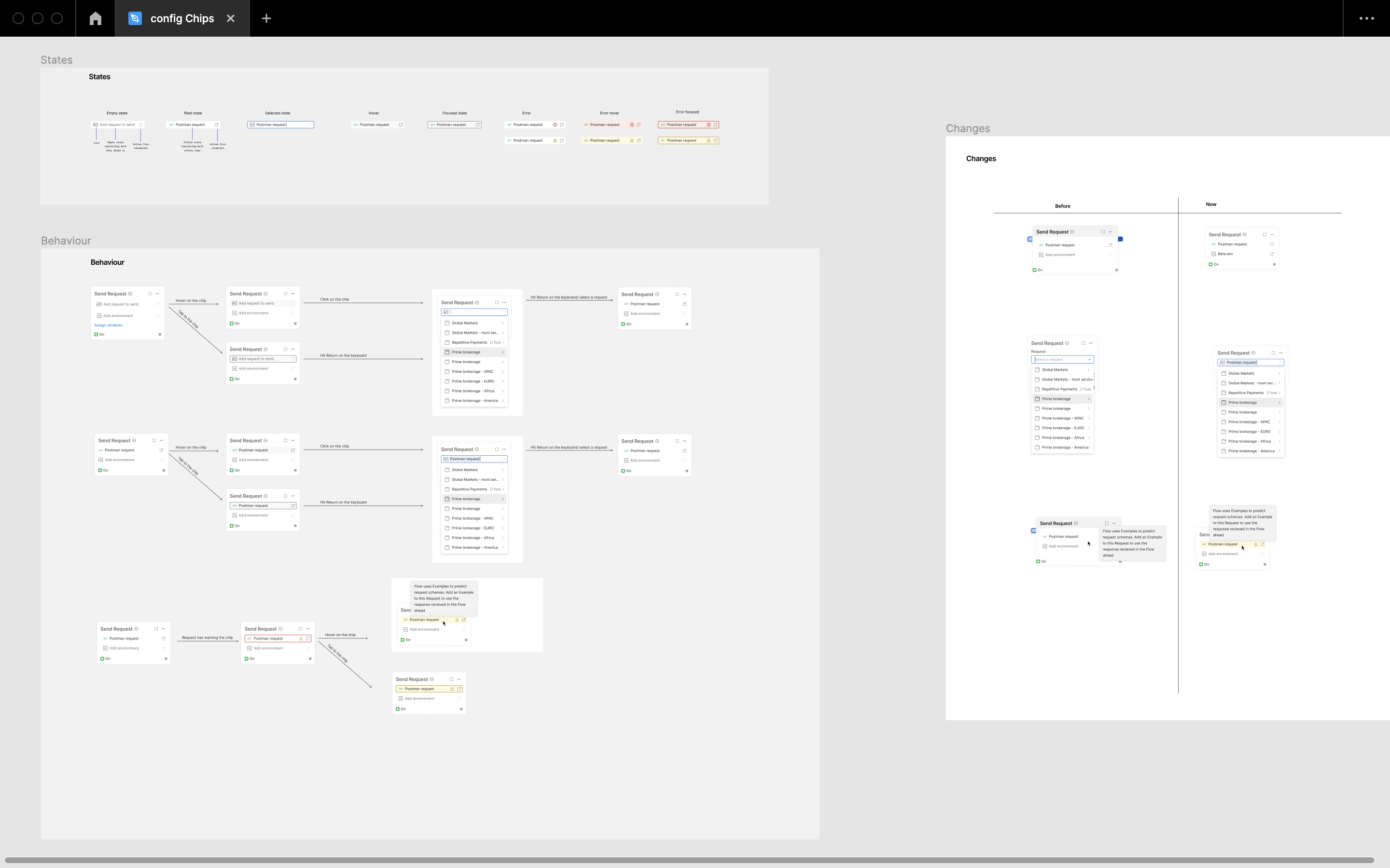
Implementing this in our team really accelerated our development process and since then many other teams in postman have also started using this system
5. Deciding slow, shipping fast
As Flows began as an experiment, we tried to not design opinionated features but experiments that would validate our hypotheses. We started shipping MVPs, which meant we did not ship fully developed features, but rather the minimum functionality required to validate our hypotheses.
Once an MVP was shipped, we collected feedback from users and iterated our approach multiple times before settling on the final solution.
6. Building feedback funnels
To ensure that we stay close to our users and don’t build in a silo, we had to build multiple avenues to get feedback.
-
Internal feedback
To get early feedback on ideas, we developed a strong RFC (Request for Comments) writing culture. Anyone from the team with an idea, could write it down in a document and share it with the entire company to get comments on. This helped us get feedback and also ideate, since writing is thinking.
-
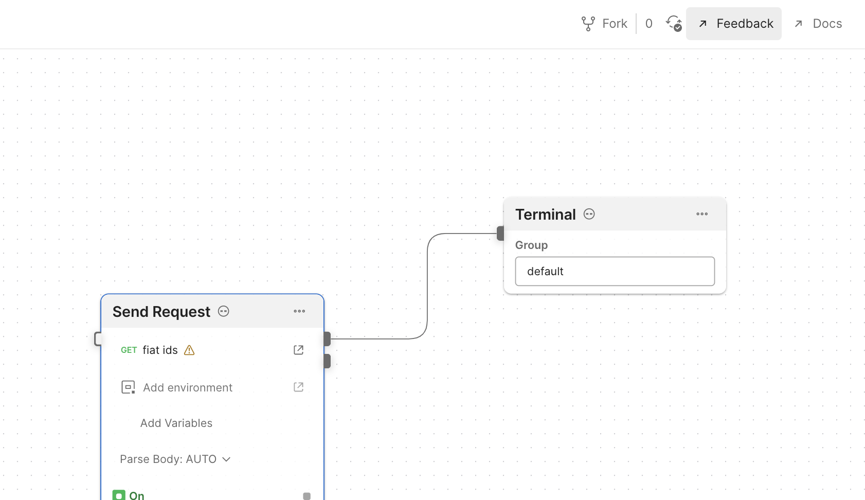
Github discussions (400+ discussion threads) - Github is a great source of feedback for postman. We wanted to tap into it as much as possible so we added a direct link to the Flows repository’s Discussion page. This proved to be great because we were able to engage in direct conversations with users and help them out in the initial days.
-
Postman flow champions - We created an external channel on Slack where we would invite users who were heavily involved in Flows. Users like Beth Marshall that were talking about flows to their audience as well
-
User video interactions - We also got into face to face discussions with our users. This helps us especially with understanding how enterprises want to use Flows with their teams.
-
Data - Lastly we collected a LOT of data on how users were using Flows from day one. Initially the scale was too small to depend on quantitative data but as we moved forward we could really assess our early decisions and pivot wherever necessary
Overall, the journey of building Flows is really the journey of me growing into a well rounded designer. I have worn multiple hats while working on flows and have understood what having deep empathy for your users and team members means. With the combination of all of these efforts, Postman Flows is close to becoming a powerful tool that helps knowledge workers realise the potential of APIs.