Context
This project was a part of a 6 week design bootcamp I attended in Bangalore. Our team of 3 designers were given the task to build an eCommerce platform for mens’ grooming products. Here, I’ve described my journey of learning the nuances of designing an effective ecommerce app and adding my own flavour to it. On the way, we made many mistakes and we learnt from them, look out for such mistakes marked in *Red. Look out for the features we thought of building in different stages of our process marked with #blue..
To sum it up (TL;DR)
The Project started with us realizing that a huge market segment was left unrepresented in the cosmetic sales industry. We went on to interview our users and found that there are a few gaps we can cover and went on to follow the design thinking process to come up with a solution. The solution I am most proud of are:
- The on-boarding survey that helps us recommend very precise products has been the highlight of the app and proves to be loved in the usability testing as well.
- The option of adding a sample so that the user has the ability to return the product if unsatisfied with it. This makes the online shopping experience closer to the offline one.
The problem
“Users prefer shopping offline rather than online.”
The cosmetic industry is huge and for good reason. It taps into deep seeded motivators and presents an instant reward as well. The industry brought in 6.25 billion in revenue in India alone. But, 80.7% of these sales were through offline stores. When compared to electronics, that sees 50% sales online, there seems to be something the present cosmetic eCommerce is doing wrong.
Why switch to online?
- Reach wider audience
- Increase convenience
“Men have been ignored”
In India, men who fall in the age group of 25 to 45, spend more money on grooming and personal care products than women! But still, men have long browsed for grooming products on interfaces that have been primarily made for women or are highly inspired by those interfaces. We thought that men fundamentally have a different relationship with grooming than women in India. This changes the motivating factors that men have to groom themselves. And hence they deserve to be studied separately.
The goal
To make an online shop for men’s grooming products that resembles an offline shopping experience.
The goal of our UX effort is to understand the upsides of offline shopping for grooming products, and break them down to analyse why the users prefer that. Then we can start to build an interface that is inspired by offline experiences.
What I don’t want to do:
- Replicate an offline experience. I fully am aware of its impossibilities
- Copy offline experiences on a surface level.
*Mistake no. 1
We started out with preconceptions.
Even before starting the project, we had ideas in our head about what our users want, how the product should be branded and designed. We assumed having a premium brand, a shop with higher priced products and a variety of luxury brands would guarantee success for us. In hindsight it sounds absurd! This led us to limit ourself and throw away ideas that could have been good. It was only later when we took a step back and looked at our users and what they actually want when we started implementing those features.
The next thing we wanted to do was talk to our users. To understand who our user is we defined a segment of the market that we want to aim our product at. If I may, it’s like adding a filter to your list of products.
Target Audience
Male. Urban.
High Disposable Income.
Metro-sexual.
Personal interviews
Our goal with the personal interview was to understand the individual process of buying grooming products both online, in order to find issues, and offline, in order to learn and implement in our app. We interviewed 4 men in our target group. We used Grand Tour questions and asked our interviewees to talk us through their recent experience buying a grooming product for themselves
“I prefer buying cosmetics in physical stores because I like to try the product first”
“I am very picky about the ingredients of the product I use on my skin”
“I like that I can talk to people in the store and explain what I am looking for to get the best suited product for my issue”
Observations:
- Our users were shopping offline for the interactive shopping experience
- Users were price sensitive
- Our users were very high on research about the product.
*Mistake no. 2:
Did Not dig deeper post interview
Once we had the interviews recorded and closed, we went through them again as a group. It was pretty embarrassing to hear myself on record but that's not the point here. We should have understood the underlying needs of the user when going over the interviews again. But instead we wrote down the pain points the user explicitly told us. For eg, one user said something about a lack of conversation on an online shop. We promptly thought of integrating an advanced chat-bot on the app. But as it turns out it had a few drawbacks:
- Chatting is not very close to an in person conversation. We have different tones while indulging in both.
- The user didn’t really crave companionship, he just wanted someone (or something as it turned out to be) to understand his needs, apply their knowledge of the product and suggest him the best alternative.
That is why in a 2nd iteration we went with an on-boarding flow that understands a user like a sales rep would and based the home screen entirely on conversational suggestions.
Surveys
At this time we had a good idea of how our user thinks. But we wanted the opinions of a larger sample size and also wanted to put a number on our design decisions. We made a small survey on google forms and spread it like wildfire. Below are some cool insights that we got out of the survey.
Observations:
- Our target audience was very particular about the ingredients of the product
- If given a better experience users would choose to buy a new product online
- Doesn’t know what kind of products could be useful for his needs.
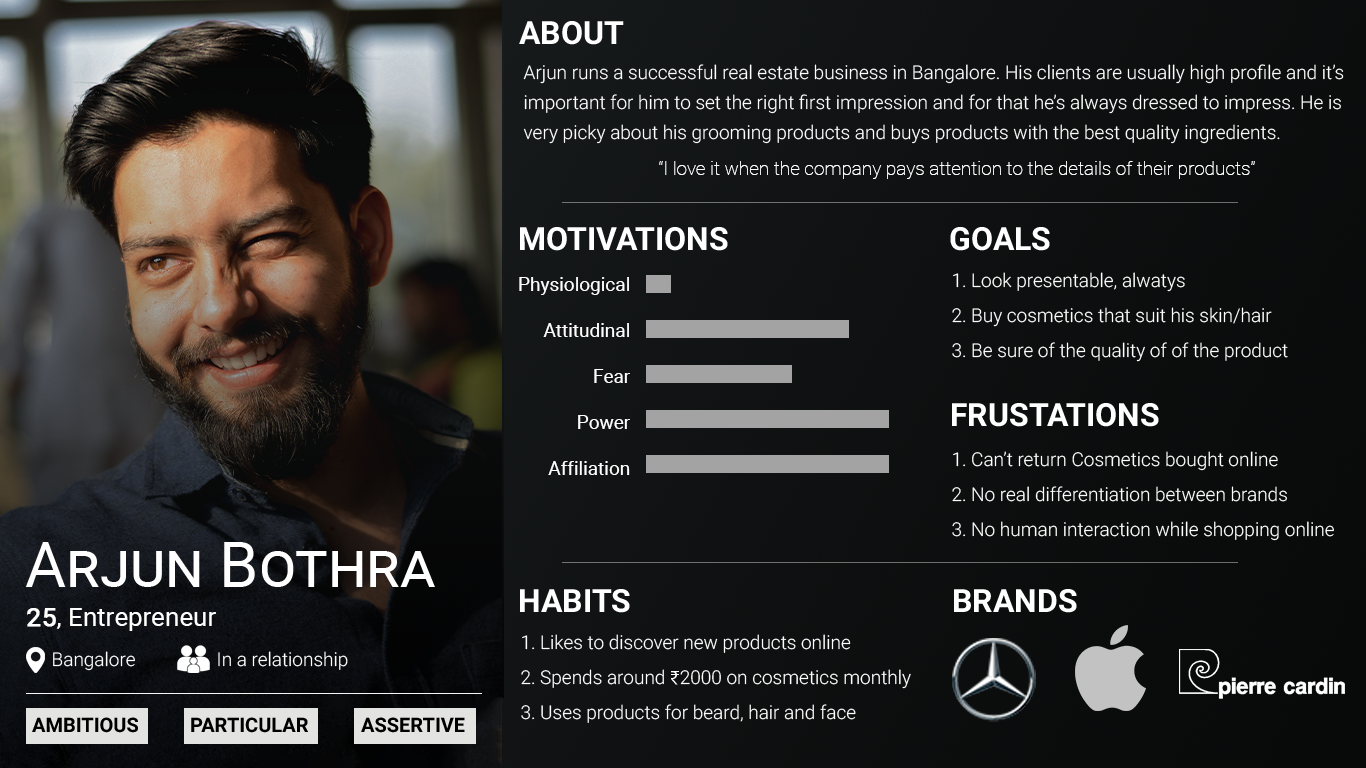
Persona
Based on personal interviews and survey answers, we made a persona representing our target audience well. The design decisions henceforth will be taken by keeping him in mind. So meet Arjun
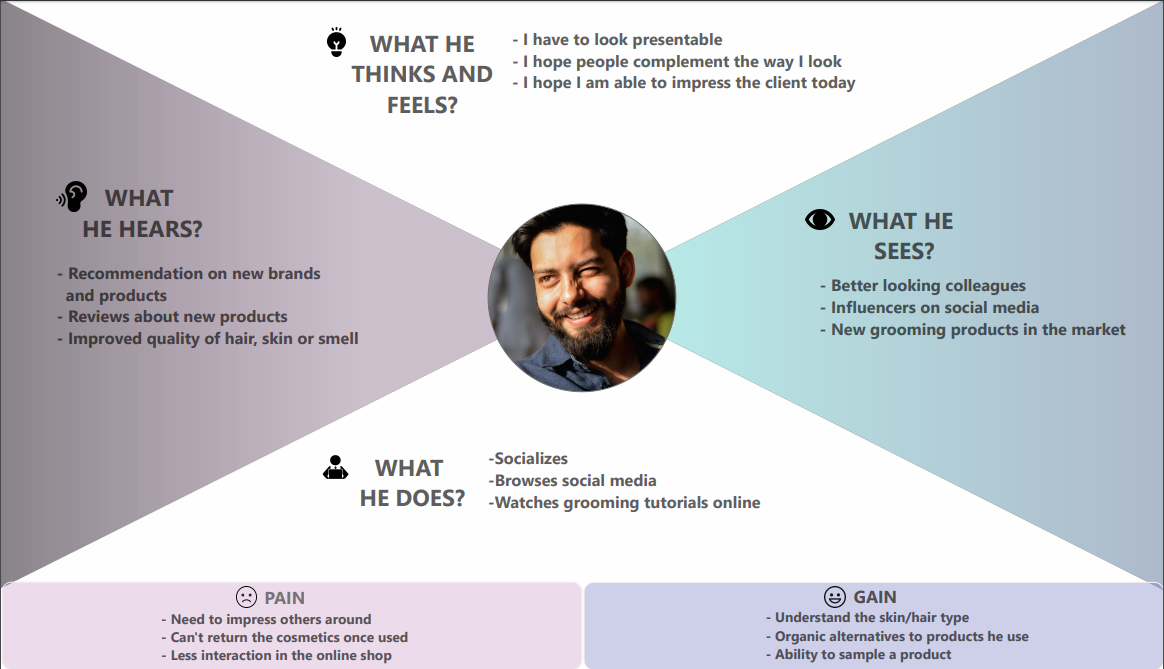
Empathy map
We used an Empathy Map to further understand the users surroundings and his perspective. An Empathy Map allowed us to sum up our learning from engagements with our perspective users. The map provides four major areas in which to focus our attention on, thus providing an overview of a person’s experience. The 4 areas refer to what the user: Said, Did, Thought, and felt
Metrics
After having understood who we are designing for I wanted to set metrics that the design will be solving for. After a little research I found 2 metrics that would be in the best interest of the business:
- Repeat Purchase Rate:
RCR= Total Repeat Purchase/Total Purchase.
The repeat purchase rate measures the percentage of your customers who come back for another purchase.
Repeat purchase rate will always range from 0% to 100%, with the higher the number the better. A rate of 0% means that none of your customers are coming back, a rate of 100% means every customer comes back and makes another purchase. - Add To Cart Ratio
ATC= product page views / buy( or add to cart ) button clicked
This ecommerce metric helps me to better understand how well my products, and the pages that advertise them, are performing.
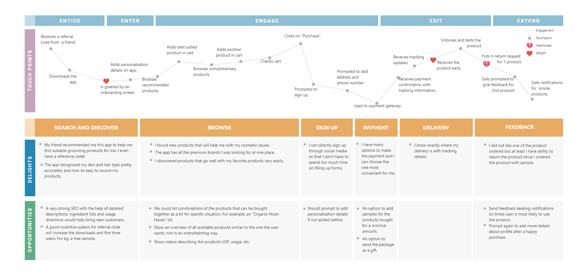
Customer Journey Map
Now that you know Arjun, let's take a hypothetical situation where Arjun has been referred to the Pulcro app by one of his friends and he downloads the app to buy a face wash for himself. Using the persona description and the empathy map we tried to map the story from Arjun’s PoW. We tried understanding what motivates him- what his needs are, his hesitations, his concerns.
The following graphs denotes the happy path that Arjun would take to interact with the app.
# Iterations are good:
While making the customer journey map, we recognised that cosmetic products are one of those products that can not have a return loop. This could be a HUGE disadvantage to a lot of the users. To solve for this I came up with a product feature where at the “check out” the user can add a product sample to certain products. If a sample is added, the user will receive the product with a mini sample box as well with enough product for 2-3 time use. If the product is suited to the user can keep the product. If not he can return the unopened product.
Card sorting.
We chose card sorting as a method to organise or categorise our products. Card sorting played a vital role in the design process because it gave us a GREAT insight into how our customers think. The insight was this:
Users wanted to place the products in the hierarchy of their preference even though we PARTICULARLY asked them not to do so. It looked as if they couldn’t help themselves.
Based on this insight we tweaked our journey map to include personalisation and made sure that henceforth we pay more attention to personalisation.
# Personalisation
The card sorting activity made us understand that our users wanted things sorted by preference. To understand this preference we build an onboarding flow where we ask users a few questions to understand their needs and use an intelligent scanner to understand their current skin type or hair type. This data will be later used to personalise their experience on the app by:
- Recommending products on the home screen
- Editing list of categories on categories page
- Adding favorite filters and arranging rest of the filters accordingly
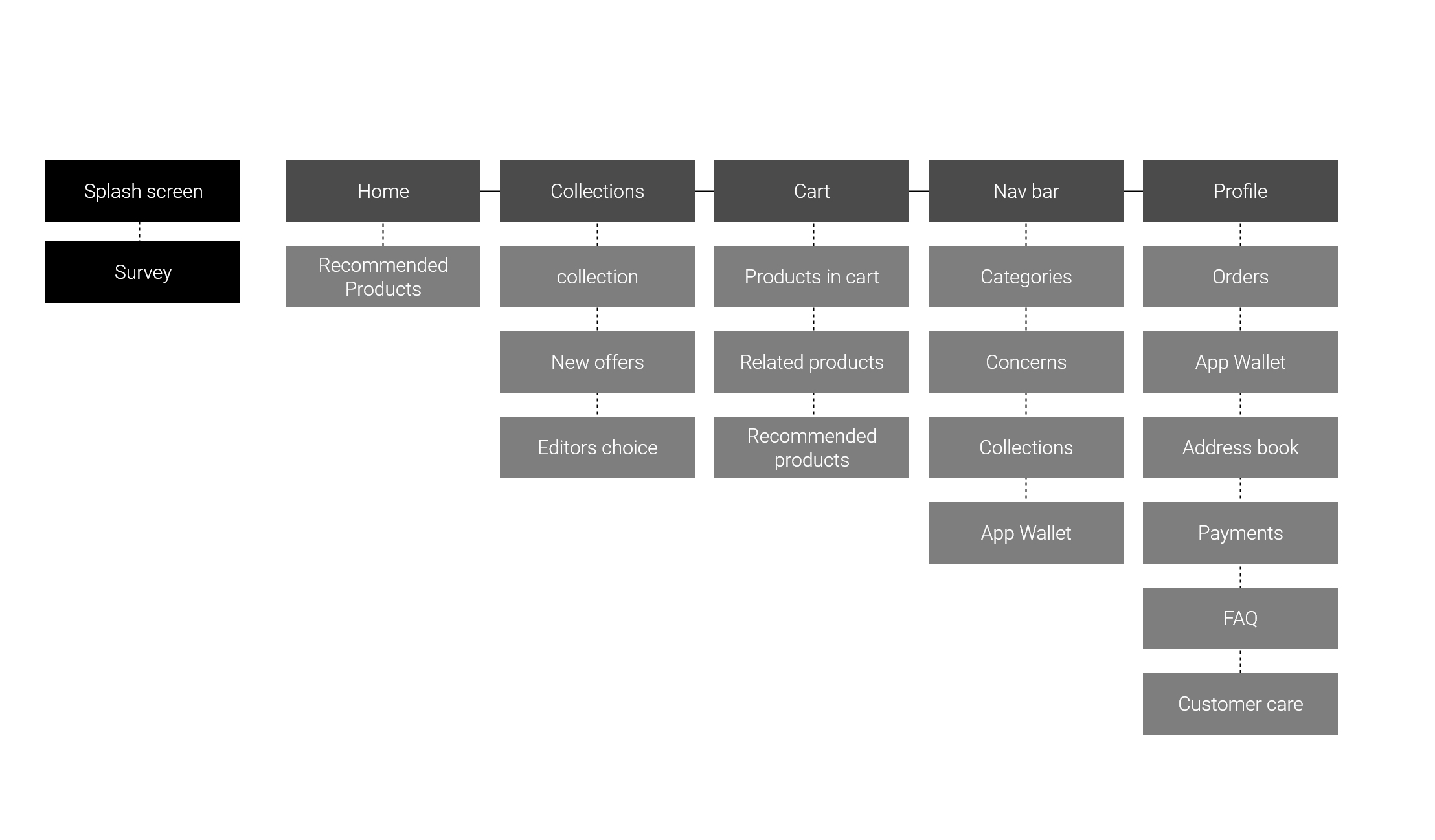
Information architecture
With the help of Information architecture I aim at organizing content so that users would easily adjust to the functionality of the product and could find everything they need without big effort. Decisions about what sits where were highly dependant on Arjun's character and what we want to incentivize in the app.
User flow
Now that we had a rough idea of who we are designing for, what we are designing and how we’re going to solve specific problems, we could lay down the foundation of the interactions that our user will have with the application. This would be done by making a detailed flow of specific route that Arjun might take to achieve his goals
Wire frames
With the user flow in the hand it was time to pick up a pen and a paper and draw out the vision of the app that had grown in my head for so long. This was an individual task and the wireframes Below are all done by me.
*Mistake no 3
Got caught up in the big picture
When it came to making wireframes, I had never designed an ecommerce app before. Therefore I got too caught up in building the nuances which all ecommerce have like wishlists and cart pages. This resulted in me not making new and exciting features like the sample option enough time. This resulted in it being a sort of hidden feature instead of a USP. I later thought that it being a hidden feature could be good for business and let it be that way.
Formative usability test
I conducted the usability test of the user flow with the help of the wireframes. A set of users from the target group were given a situation and a task to achieve on the app through the wireframes.
Task: Buy a shampoo for you dry and rough hair.
Observation: the user was able to navigate through the app well but wasn’t able to recognize the card group that recommended him shampoos for his condition. I think I would be able to solve that problem through the UI of the app.
Final Designs
As a part of the course, I was supposed to create screens for: 1) iOS 2)Android and 3)a Marketing Website.
All had to use different colors and style to add versatility to my portfolio
iOS
Android
Marketing website